
Interior design: Colour Crises...and how to avoid them!
(with a little bit of history and science thrown in!)
Eleni Fantis, 16/08/2021
Colour quandaries when decorating, whether it’s paint, tile, flooring, or furnishings, are probably the most common dilemmas that we all go through at some point – I am still scarred from the memory of painting my dining room three times in five days until I got the exact tone of blue that was in my head!
It’s important to remember, when faced with the thousands of options available in, for example, DIY stores’ paint-mixing departments, that you are only considering which one of seven colours of the spectrum to use…yes, you read that right – you are simply choosing one of seven colours and then deciding on a tone or shade of that colour.
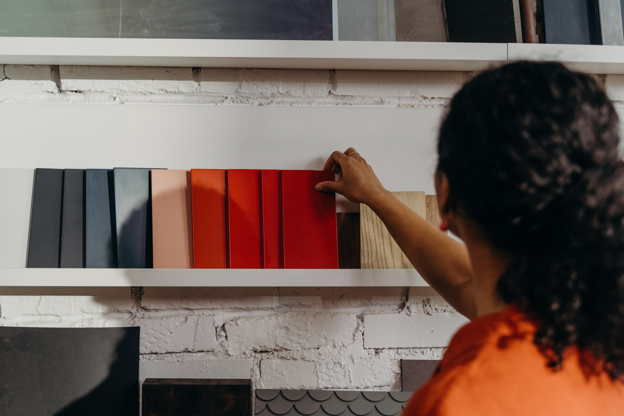
The colour wheel (developed by Sir Isaac Newton in 1666) goes further in its visual representation of 12 colours, split into warm and cool shades and made up of three primary colours, three secondary colours (created by mixing two primaries) and six tertiary colours (created from a mix of a primary and a secondary colour). The wheel is used in a vast number of industries and arts; in interior design it illustrates which hues coordinate well, depending on the type of scheme you are going for. Broadly speaking, your room colour palette will be either ‘Harmonious’ (using two adjacent colours on the wheel), ‘Tonal’ or ‘Monochromatic’ (using various shades of the same colour), or ‘Contrasting’ (using colours opposite each other on the wheel).
I always advocate that your home should reflect your personal likes and dislikes, and that you shouldn’t feel constricted by trends or design ‘rules’. There are, however, considerations that you should follow to maximise your homes potential and your love for it:
Light and Direction
Light, both natural and artificial, is key to how colours appear to us; in north-facing rooms, the light entering is cool/blueish causing lighter colours to look subdued – bold colours will, therefore, show up better. In a south-facing room, the natural light will enhance both cool and warm colours. With an east-facing rooms, the light changes from a warm yellowy tone in the morning to a bluer tone later in the day – these rooms work well with oranges, yellows, and reds. Finally, a west-facing room will have little light in the morning, making colours appear dull and flat, but they benefit from a beautiful warm light in the evening when even neutrals will seem to come alive and glow.
You should also consider your artificial light sources – especially since in the UK, we have long winters and some overcast, grey days even in summer. With the phasing out of incandescent and halogen bulbs, most bulbs now are LEDs. These are available in both cool and warm tones as well as ‘smart’ options that are wirelessly controlled and allow you to mimic the colour of the morning sun or an evening sunset.
So now you have a brief guide to the science of colour, how do you translate that into choosing a colour palette?
1. Open your wardrobe! People are often drawn, sometimes subconsciously, to a particular colour, and your wardrobe (especially if arranged in blocks of colour) will show you this. Is there a colour that dominates or is your go-to choice when you are fed up or can’t decide what to wear?
2. Take inspiration from something you already own - or would love to own! This could be anything from a favourite mug, a piece of art you admire or your neighbour’s car!
3. Consider what must stay in the room such as flooring, sofa, or curtains and from there, decide on whether you want a harmonious, tonal, or contrasting scheme.
4. Instead of using paint testers on your wall, paint an A4 or A3 white foam board or piece of card. This allows you to move the sample around the room, checking the colour in different spots and at various times of the day. (This also stops your room looking like a patchwork quilt by the time you decide on a colour!)
5. Consider the psychological effects of colours (e.g., red is energising, blue is tranquil), the purpose of the room, and whether your home needs to appeal to others – if you are thinking of selling your home soon, a red and orange bathroom is probably not in your best interests, no matter how much you love it!
We offer a Colour Consultancy service as one of our packages; if you’d like to take the stress out of making these decisions for your home or business, get in touch via the contact form or call/email us - we’d love to help!